EHAV was a focused mobile design adaptation project. I translated an existing Figma desktop design into clean, developer-ready mobile layouts for two main pages and the site navigation, keeping the visual style consistent across breakpoints.
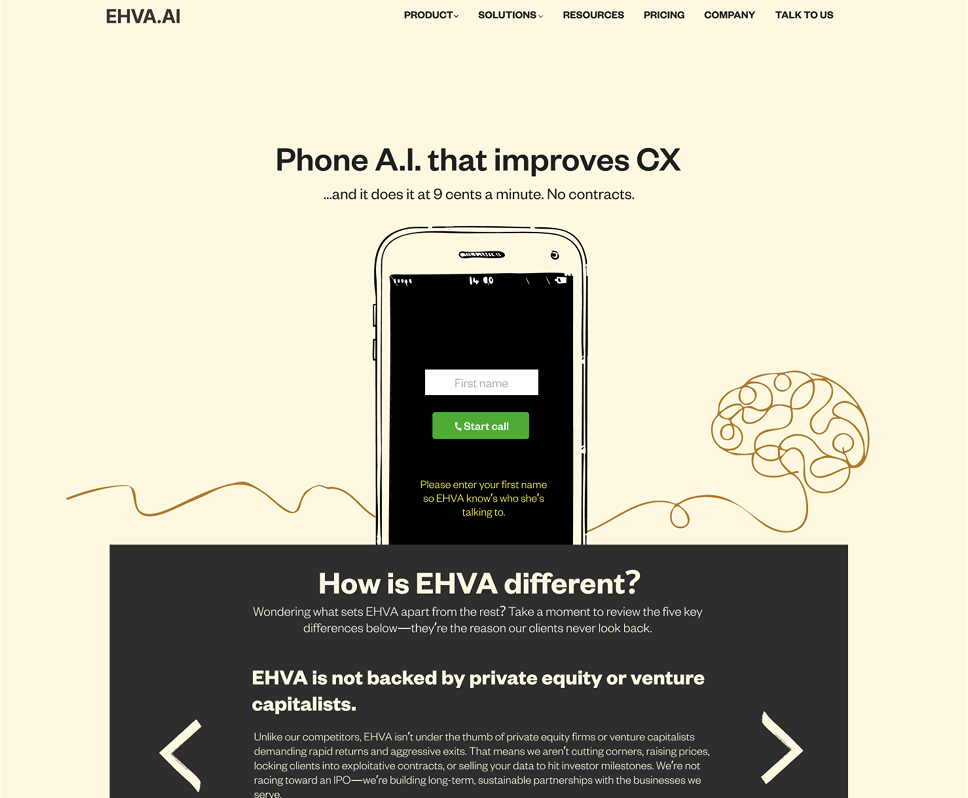
The desktop design already had a defined visual direction, so the mobile work needed to adapt rather than reinvent. The challenge was to preserve hierarchy, spacing, and brand consistency while creating layouts that would be practical for development.
I worked on mobile UI design, Figma design adaptation, responsive layout planning, navigation design, developer-ready mobile layouts, visual consistency, and UI/UX.
The mobile layouts were designed to keep the page structure clear on smaller screens. I adapted content order, spacing, sections, and interface details so the pages would feel intentional rather than simply compressed.
The navigation was reworked for mobile use, with a focus on clarity, tap-friendly structure, and visual consistency with the existing desktop direction.
EHAV received clean, developer-ready mobile designs that matched the desktop website style and gave the development team a clearer responsive direction for implementation.
Credits: mobile UI design, Figma adaptation, responsive layout planning, navigation design, developer-ready mobile layouts, visual consistency, and UI/UX by Mihai Gavrila.